- Published on
ABP React CMS Module: Building Dynamic Pages with Puck Editor
Table of Contents
Introduction
The CMS feature lets non-developers build pages visually while the ABP CmsKit module handles persistence, permissions, and multi-tenancy. In the admin UI, Puck provides a drag‑and‑drop editor; its JSON output is saved to CmsKit via the generated TypeScript client. On the public site, pages are fetched by slug from CmsKit and rendered with Puck’s renderer. ABP’s policy system controls who can create/edit pages, and per‑page CSS is supported; inline scripts are intentionally disabled for security.
Motivation
I’ve used Orchard Core CMS for years and appreciate its simplicity and rich feature set. When ABP introduced its CMS module (CmsKit), I was excited to adopt it—but a few Orchard features I rely on weren’t yet available. Rather than switch tools, I looked for a way to pair ABP’s robust backend with a modern authoring experience. That’s where Puck Editor fits: a lightweight, extensible visual page builder. This project shows how to combine ABP CmsKit for storage/permissions with Puck for visual editing, aiming to approximate my Orchard Core workflow while staying within the ABP ecosystem.
Feature overview
- Visual page building with Puck (drag‑and‑drop blocks, editable fields)
- Pages stored as JSON in ABP CmsKit
- Public rendering by slug with safe defaults
- Per‑page custom CSS support (script execution disabled by design)
- ABP policy-based access for create/edit operations
Prerequisites
- ABP CmsKit module is enabled and configured on the API side (including required migrations and endpoints).
Links
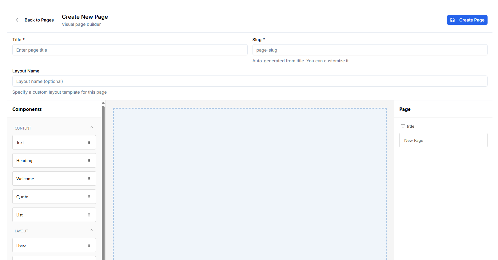
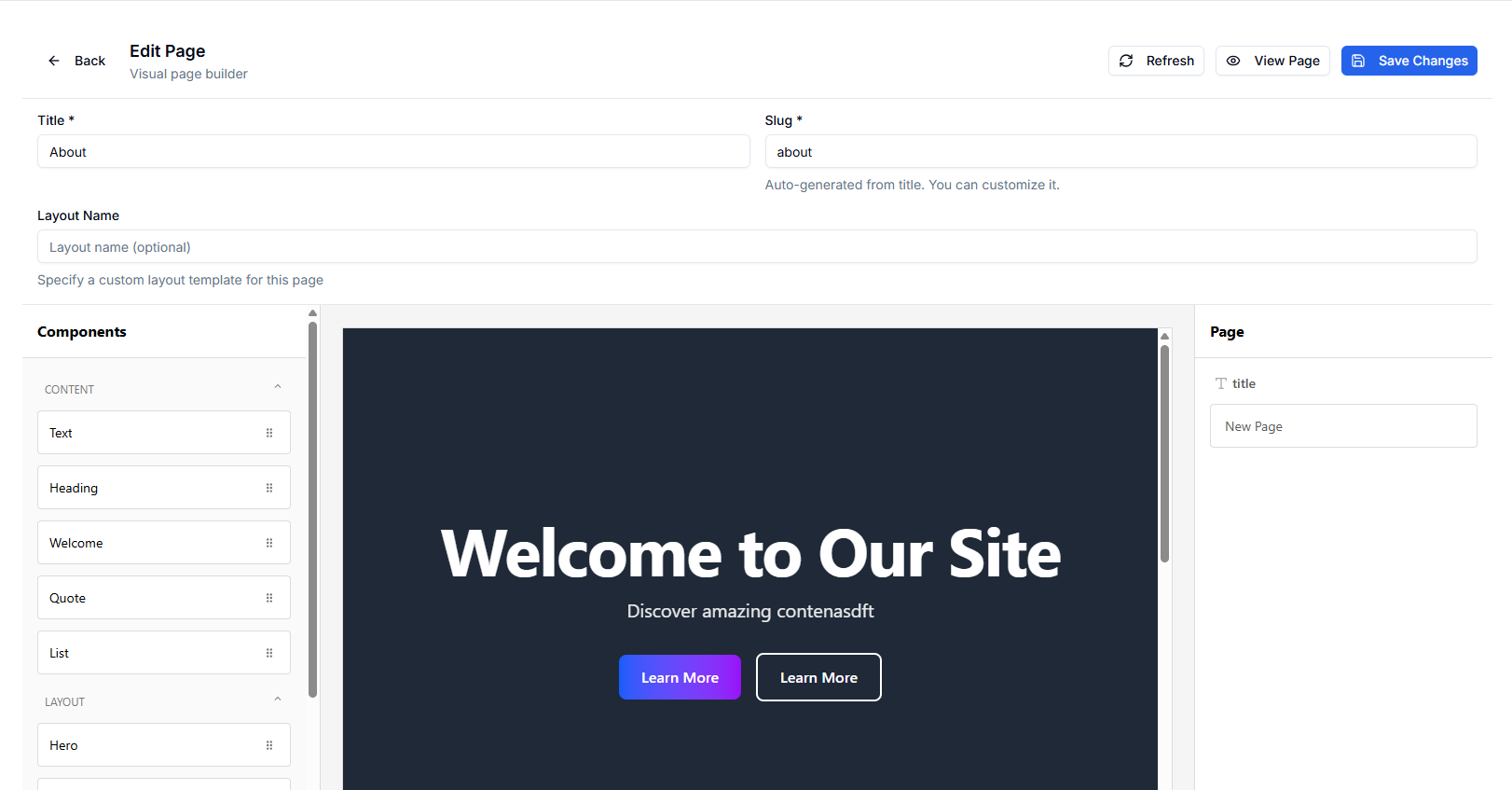
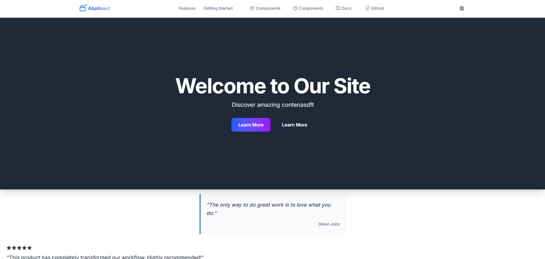
Some screenshots
How it works
- Admin (create/edit):
/admin/cms/pages→ Create a page, then build content visually with Puck.- Code:
src/src/app/admin/cms/pages/page.tsxandsrc/src/app/admin/cms/pages/create/page.tsx
- Code:
- Public (view):
/pages/[slug]dynamically renders content.- Code:
src/src/app/pages/[slug]/page.tsx→PageView→ PuckRender
- Code:
- Puck configuration: All available blocks and categories are registered in
src/src/components/puck/config.tsx. - Rendering:
PageViewconverts stored content (JSON) to Puck data and renders it.- Code:
src/src/components/page/PageView.tsx
- Code:
Notes
- Content is saved as Puck JSON (stringified) to the backend via the generated client in the admin create/edit pages.
- Custom CSS per page is supported; inline scripts are intentionally disabled for security in
PageView.
Where to look in the code
src/src/components/puck/PuckEditor.tsx: the in-app editor wrapper used in admin screens.src/src/components/puck/config.tsx: block registry and categories.src/src/components/puck/components/*: individual blocks (e.g.,TextBlock,HeadingBlock,Hero, etc.).src/src/components/page/PageView.tsx: safe rendering of stored content.
View blocks in Storybook
You can browse and test all available blocks in Storybook with live controls (props) that mirror the Puck fields.
- Run Storybook from the
src/folder:pnpm storybookornpm run storybookoryarn storybook
- Open
http://localhost:6006and navigate to:Puck Blocks/*stories such asHeadingBlock,TextBlock,GalleryBlock, etc.
- Stories live alongside components, for example:
src/src/components/puck/components/GalleryBlock/GalleryBlock.stories.tsx
Documentation
- Full docs site: ABP React Documentation
- CMS overview and admin UI: Admin Interface → CMS
- Components and development guides are available under the Docs navigation (Components, Fundamentals, Tutorials).
Add a new Puck block
Blocks live under src/src/components/puck/components/<YourBlock>/. A minimal block consists of:
YourBlock.tsx: how it rendersYourBlockProps.ts: props typeYourBlockDefaults.ts: default propsYourBlockFields.ts: editor fieldsconfig.ts: Puck config wrapperindex.ts: optional re-exports
Below is a complete example for a simple "Callout" block.
- Create files under
src/src/components/puck/components/CalloutBlock/:
// CalloutBlockProps.ts
export type CalloutTone = 'info' | 'success' | 'warning' | 'danger'

export interface CalloutBlockProps {
  message: string
  tone: CalloutTone
  align: 'left' | 'center' | 'right'
  padding: string
}
// CalloutBlock.tsx
'use client'
import type { CalloutBlockProps } from './CalloutBlockProps'

const toneStyles: Record<CalloutBlockProps['tone'], React.CSSProperties> = {
  info: { backgroundColor: '#eef2ff', color: '#1e3a8a', border: '1px solid #bfdbfe' },
  success: { backgroundColor: '#ecfdf5', color: '#065f46', border: '1px solid #a7f3d0' },
  warning: { backgroundColor: '#fffbeb', color: '#92400e', border: '1px solid #fde68a' },
  danger: { backgroundColor: '#fef2f2', color: '#991b1b', border: '1px solid #fecaca' },
}

export const CalloutBlock = ({
  message,
  tone = 'info',
  align = 'left',
  padding = '16px',
}: CalloutBlockProps) => {
  const style: React.CSSProperties = {
    ...toneStyles[tone],
    textAlign: align,
    padding,
    borderRadius: 8,
  }
  return <div style={style}>{message || 'Callout message...'}</div>
}
// CalloutBlockDefaults.ts
import type { CalloutBlockProps } from './CalloutBlockProps'

export const CalloutBlockDefaults: CalloutBlockProps = {
  message: 'Heads up! This is a callout.',
  tone: 'info',
  align: 'left',
  padding: '16px',
}
// CalloutBlockFields.ts
import type { Field } from '@measured/puck'

export const CalloutBlockFields: Record<string, Field> = {
  message: { type: 'text', label: 'Message' },
  tone: {
    type: 'select',
    label: 'Tone',
    options: [
      { label: 'Info', value: 'info' },
      { label: 'Success', value: 'success' },
      { label: 'Warning', value: 'warning' },
      { label: 'Danger', value: 'danger' },
    ],
  },
  align: {
    type: 'select',
    label: 'Alignment',
    options: [
      { label: 'Left', value: 'left' },
      { label: 'Center', value: 'center' },
      { label: 'Right', value: 'right' },
    ],
  },
  padding: { type: 'text', label: 'Padding (CSS)' },
}
// config.ts
import { CalloutBlock } from './CalloutBlock'
import { CalloutBlockDefaults } from './CalloutBlockDefaults'
import { CalloutBlockFields } from './CalloutBlockFields'

export const CalloutBlockConfig = {
  label: 'Callout',
  fields: CalloutBlockFields,
  defaultProps: CalloutBlockDefaults,
  render: CalloutBlock,
}
// index.ts
export { CalloutBlockConfig } from './config'
export { CalloutBlock } from './CalloutBlock'
export { CalloutBlockDefaults } from './CalloutBlockDefaults'
export { CalloutBlockFields } from './CalloutBlockFields'
export type { CalloutBlockProps } from './CalloutBlockProps'
- Register the block in
src/src/components/puck/config.tsx:
// imports
import { CalloutBlockConfig } from './components/CalloutBlock/config'
import type { CalloutBlockProps } from './components/CalloutBlock/CalloutBlockProps'

// extend Props
type Props = {
  // ...existing entries
  CalloutBlock: CalloutBlockProps
}

export const config = {
  components: {
    // ...existing entries
    CalloutBlock: CalloutBlockConfig,
  },
  categories: {
    // ...existing categories
    content: {
      title: 'Content',
      components: [
        // add it to a category so it shows up in the palette
        'TextBlock',
        'HeadingBlock',
        /* ... */ 'CalloutBlock',
      ],
    },
  },
} as const
Validation: register the component type
The editor validates component types via validComponentTypes inside ensureValidPuckData. If you add a new block, update this list or the component may be filtered out.
- File:
src/src/components/puck/utils.ts
// inside ensureValidPuckData
const validComponentTypes = [
  'HeadingBlock',
  'TextBlock',
  'WelcomeBlock',
  'Hero',
  'ImageBlock',
  'CardBlock',
  'ButtonBlock',
  'ContainerBlock',
  'DividerBlock',
  'FlexBlock',
  'GridBlock',
  'SpacerBlock',
  'VideoBlock',
  'GalleryBlock',
  'CarouselBlock',
  'ListBlock',
  'QuoteBlock',
  'TableBlock',
  'TestimonialBlock',
  'CalloutBlock', // add your new block here
]
That’s it. The new block appears in the Puck editor palette, can be dragged onto the canvas, configured via its fields, and is rendered on public pages automatically.
Tips
- Keep
Propsexplicit and reuse union types for strict editor options. - Use
defaultPropsgenerously so new blocks look good immediately when dropped. - Prefer simple inline styles for blocks unless you need shared styling.
Conclusion
ABP CmsKit provides the backend foundation—storage, permissions, and multi‑tenancy—while Puck supplies an intuitive visual editor. Together they deliver a lightweight CMS that’s easy to extend: add a block, register it in the config, include it in validation, and you’re ready to build pages. This setup keeps authoring simple and code maintainable, without giving up ABP’s enterprise features.
Related Posts
Continue reading with these related articles
Introducing SimpleModule: A Modular Monolith Framework for .NET 10
Meet SimpleModule, an experimental .NET 10 framework that uses Roslyn source generators to build modular monoliths with compile-time module discovery, full-stack type safety, and Inertia.js-powered React UIs.
Migrating an ABP Frontend from Next.js to TanStack Start
A real-world case study of moving abp-react from Next.js App Router to TanStack Start — what changed in routing, SSR, OIDC, the generated API client, state, and Docker.
OpenID Connect with Next.js 15 and openid-client 6
A guide to implementing secure authentication using OpenID Connect in Next.js 15 with the openid-client library version 6